ISAGENIX - Essence Essential Oils
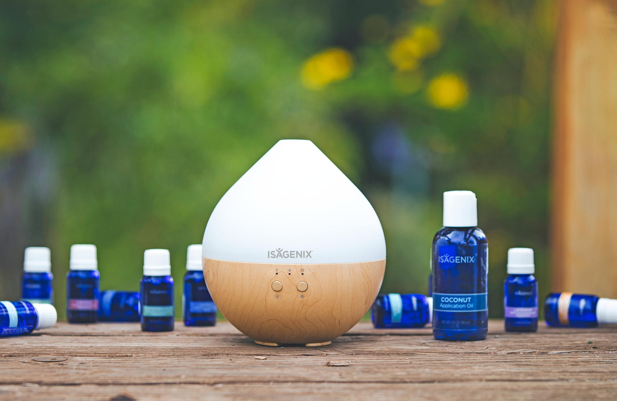
This project was a fun one. I was heavily involved in the marketing for this line, from concept to launch.
As the only designer on this massive project, I designed the overall look and branding. Everything you see, from the labels, colors, booklet, paper stock to the structure of the boxes. It all came together beautifully. Lead three separate photoshoots (scouting, budgeted assets/models, directing) that helped drive the launch of this line, which also provided assets for multiple promotions and campaigns post launch.
LiaLynn Activewear
Worked on this brand for a client who wanted to start an athletic clothing line with his 2 daughters. I really wanted to add their character and personalities into the brand as much as I could. They wanted something that targeted younger girls, but still captured an older audience.
Having them be involved as much as possible was important for me to help tell their story. Allowing their personalities to stand out in the look and feel of the branding as well as the social messaging was a fun process.
Below are some mocked up apparel pieces I put together. I also created some social posts and messaging based off some important key words I asked them to jot down during the consultation phase. The line is still a work in progress, but look forward to doing some more branding for them as they grow.
ISAGENIX - IsaKids Super Smoothie
This was another interesting product launch. I designed the packaging for these two new shakes, both specifically meant for children 4 and up. This was the first time we would target children.
Designing this was tricky. I needed to come up with a look that not only appealed to children, but their parents. These were not products that were sold on shelves, so the parents needed to love what was in the packaging, not just how fun it looked. So calling out the healthy ingredients and nutritional facts were important, but at the same time, I needed to make the design pop and stand out to kids, so they would even want to try it. The characters on the back were the fun elements I thought of adding at the end.
There were a few designs I mocked up, but a lot of research and testing went behind the final decision, not just for the taste, but for the branding as well. This was the one that stood out the most.
I also designed the website and directed the photoshoots for this product launch.
Bumkins - #BeKind21 Campaign
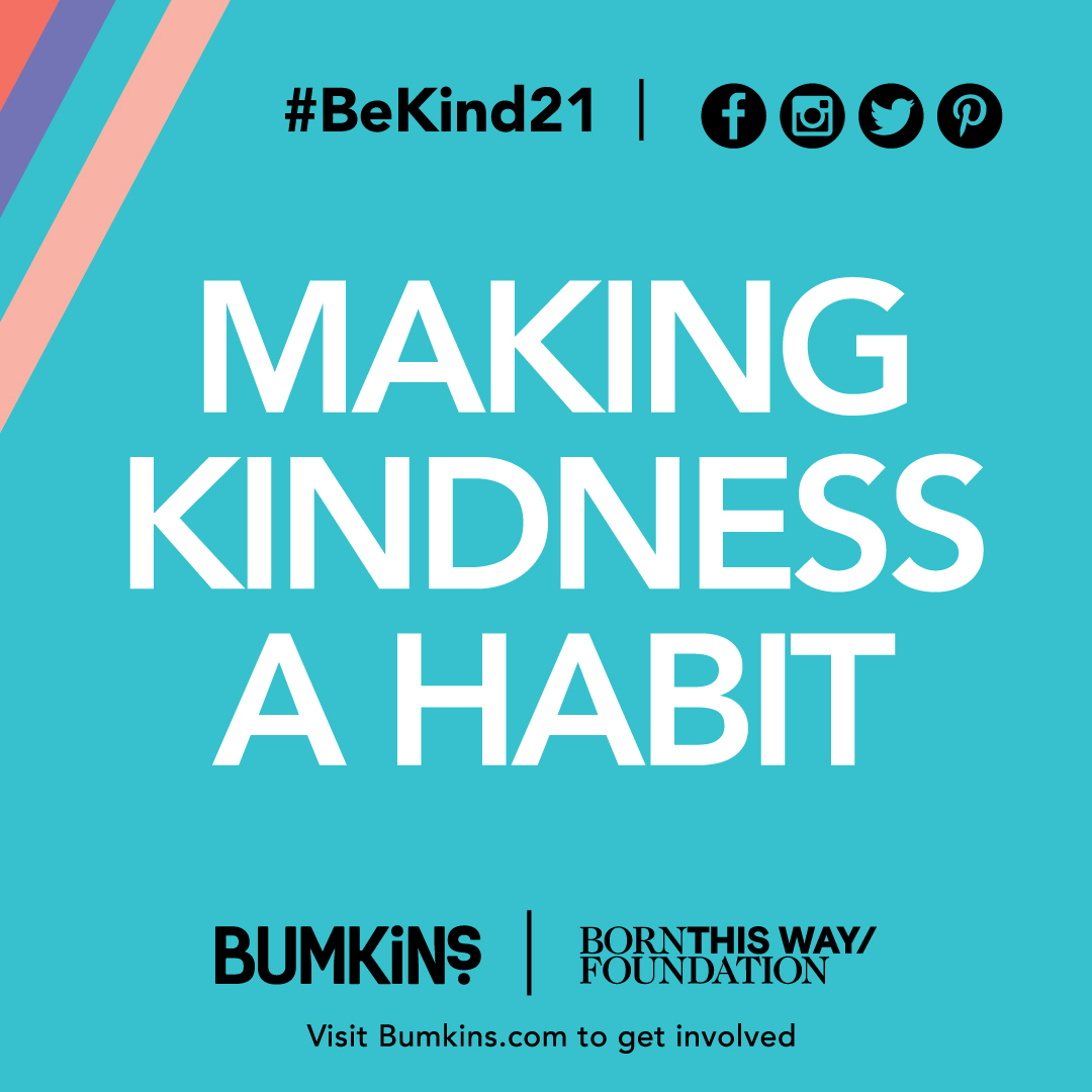
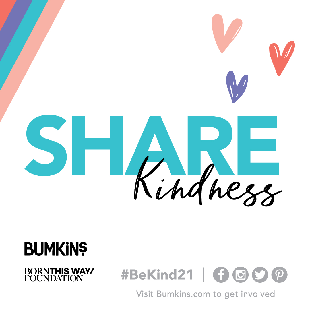
Bumkins was honored to partner with Lady Gaga's Born This Way Foundation to amplify their annual #BeKind21 challenge.
In my first week with Bumkins, I was asked to brand the campaign. The look and feel had to combine the two brands in a way so that one would not stand out too much from the other. I kept it clean and vibrant, using elements from each of their brand identities.
There were a few printed materials created, which would be made available for all contributors to share. The branding was used across all social platforms, the website and anything relating to this amazing campaign.
BEA Sparkling Energy Drink
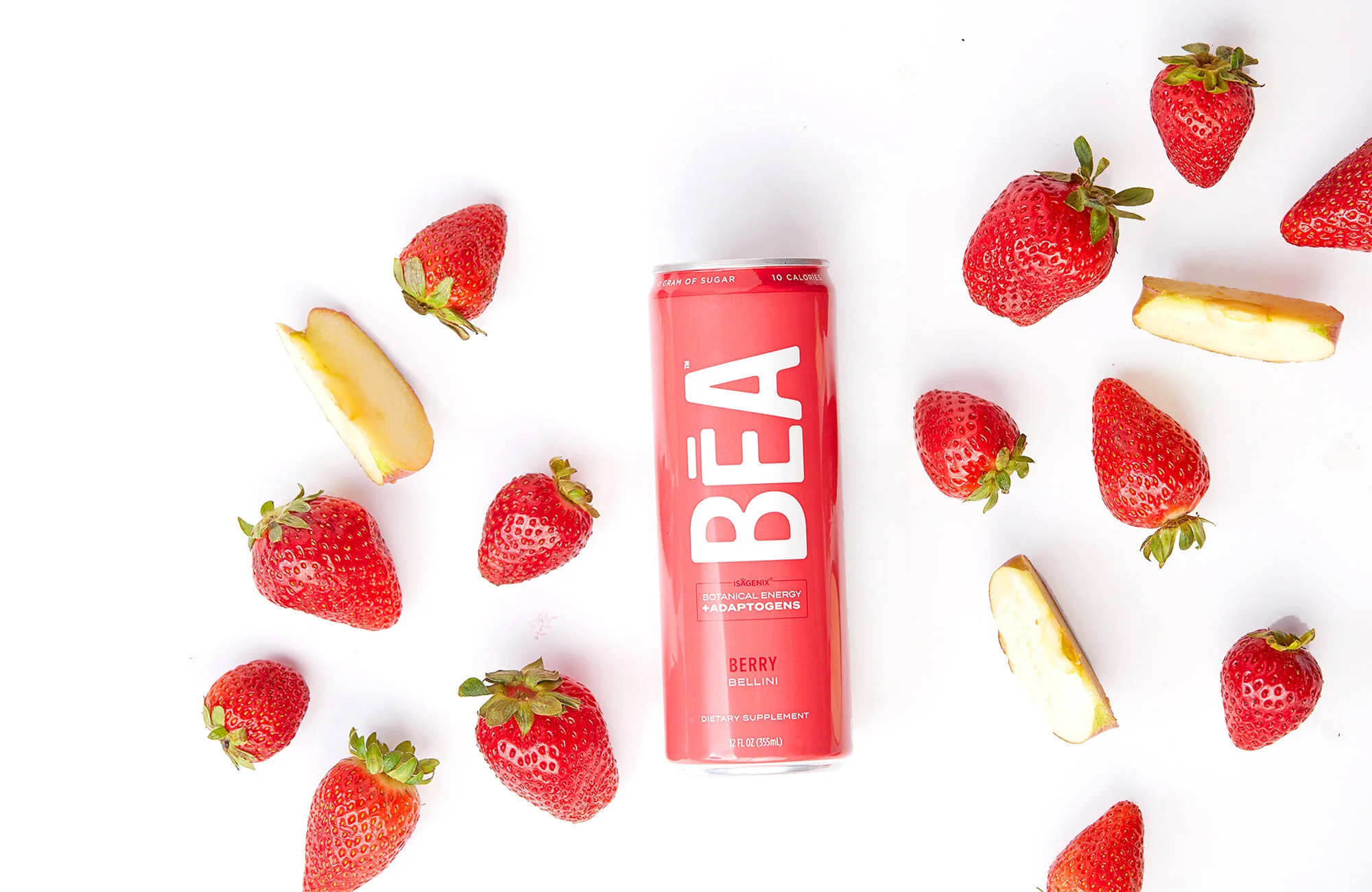
Energy drinks by all means are not a new thing. There are so many of them out there.. BUT, the majority of them are branded to target men. They are all dark, and/or aggressive looking. This specific product was meant to target women. Something that they wouldn’t mind walking around sipping.
Even though it was strategically branded for the ladies, it still needed to appeal to men. Ideally, we still wanted anyone to feel that this product was made for them.
Once the look and feel was established, the campaign messaging followed. The deadline was approaching but we still did not know what to call it. We spent days thinking of the right name and meaning. One night I thought of names of powerful women and it lead me to greek goddesses. Bia was a greek goddess of power.. and after more research, the word BEA meant beautiful and perfect woman.. which happened to work as an acronym for.. Botanical Energy + Adaptogens.
I was really proud of the name, branding and messaging. We were able to use the name to tie into our campaign, motivating our audience to feel like they can do anything. For example.. Be a Leader.. Be a Rockstar.. Be a Role Model. The company loved it, as well as our associates/customers.
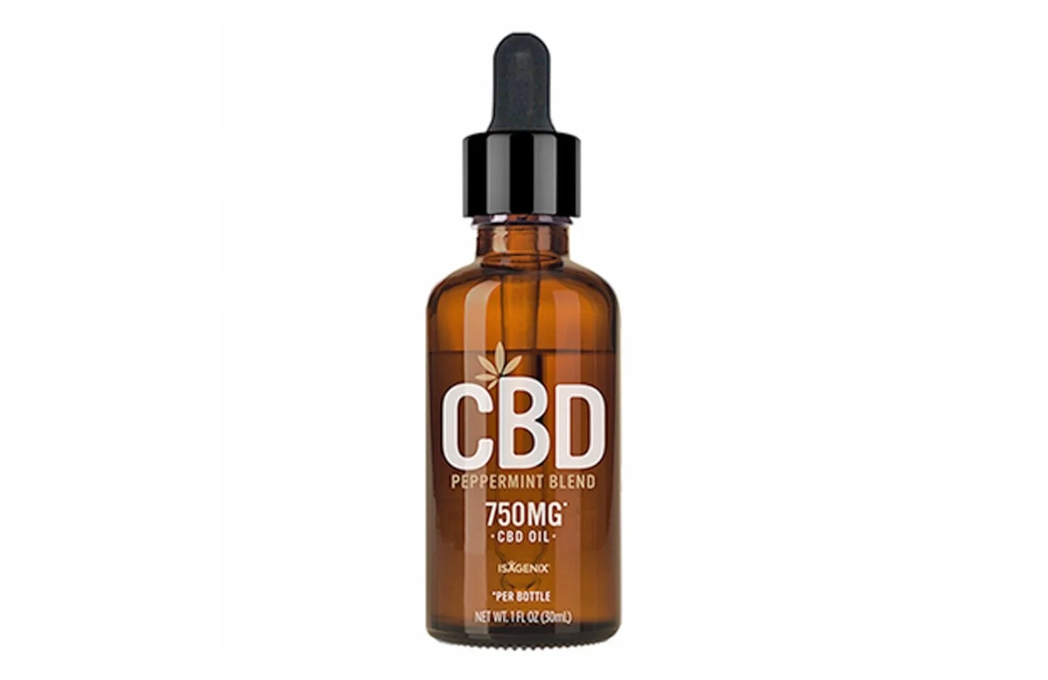
ISAGENIX - CBD Peppermint Blend Oil
I designed the label and box for this product. It was due to launch in the holiday catalog, so the imagery revolved around the holidays and gift giving.
I also designed the full catalog website and directed the entire holiday product photoshoot, which consisted of 95 final shots.
ISAGENIX - IsaLean Seasonal Flavors
These are the products that got me into designing packaging. It was a last minute request from our VP of Marketing for our annual seasonal flavors. She was not happy with what an outsourced company had come up with, and asked if I could help. From about 4 different options, these were the winners.
I wanted to do something fun, like a limited edition, collectors piece. Really bring you into the scene of when and where you would think of these flavors. After designing the labels, I was also lucky enough to stage and direct the photoshoots. Wanted to capture the scene as best as I could in real life. The s’mores shoot was probably one of my favorite (and coldest) photoshoots to this day.

